Occasionally I get an email from a reader and recently I've had two with similar questions. They both asked me about beginning scrapbooking, so here is some advice for getting started.
What Do I Need?
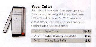
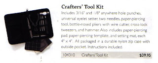
Scrapbooking is a wise investment since you are creating something that will last for many generations, but you really don't need to spend a lot of money to get started. I recommend a good paper trimmer, sharp scissors, and a crafters tool kit to begin with. You'll also need paper and double sided tape, both of which should be archival safe. With these items you can create simple "no-frills" pages, but if you'd like to create something more artistically expressive, you'll want to expand your supplies with a few gadgets and some nice embellishments as well.


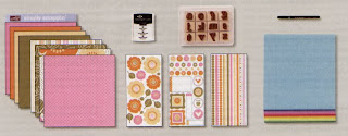
Rubber stamps, and a few ink colors (go for the pigment inks) can add a lot to a scrapbook page. You might also like brads, ribbon, punches, paper flowers...the list can go on and on. Try not to be overwhelmed, buy what you need as you need it to minimize the cost of your new hobby. You could even start with themed "kits" which could make these decisions much easier. Stampin' Up! has a great line of products they call Simply Scrappin' which along with the items pictured above can be purchased through my website.
Believe me, it won't be long before you'll have WAY more consumable supplies than you know what to do with...and you'll wonder how on Earth they've taken over your life!! hee hee
Choose Photos and Color Scheme
Depending on the album size you've chosen, select an appropriate number of photos. Can I get them all on one page or should this be a two page layout? Don't be afraid to trim your photographs and remove excess background. Be conservative, you can always go back and take off more. If you are working with digital photos fix red eye and do most of your cropping BEFORE you print. You can also try printing a few versions of the same photo cropped in different ways. That can be a fun way to use a favorite photo when you don't have additional shots to use with it! Here are two examples of cropping:

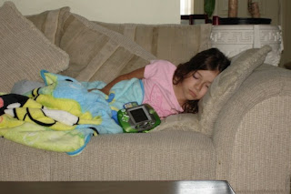
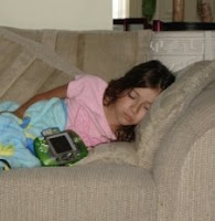
This is my original photo.

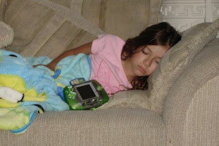
This is how it might look if I simply trimmed some excess and added it to a layout.

This is the same photo cropped BEFORE printing. If you do this make sure you pay attention to the aspect ratio, I made sure mine was 4x6 and I centered her as much as possible. Notice she is zoomed in closer and you can no longer see the coffee table at the bottom. It's a better looking version of the original photo, and because I didn't zoom in too close I can still trim more off when I pick up my prints (if I choose to). This would help me squeeze more pictures on a page...which is something I tend to do!
Once all of your photos are cropped to your liking, study them for a similar scheme. Look for similarities in the background colors or the clothing color of the photo's subjects. The best color selection will accent and compliment your photos. To figure out which colors look the best, try laying your photos on a few different colors of card stock. Choose the color that best accents the photograph. Using one color for the background page and another color for matting your photos creates a great looking layout.
Arrange the Layout
Play with the arrangement of your photos until you are pleased with the layout. I like to overlap photos and embellishments sometimes, but I suggest at the very least you keep the photos "clustered" together to enhance the look of your page.You can also follow a sketch, which for some people makes completing pages much easier.
Matting is a simple way to make your photos POP. Matting is done by laying your photos on a piece of card stock 1/8 to ½ inch larger than your photograph. This gives the photos a finished or framed look. For added effect, you can double or triple mats with different colors behind your photos.
Be smart when you cut into patterned paper. Don't toss anything larger than 1/2 an inch. Scraps can make wonderful embellishments that will coordinate with your page. Cover chipboard pieces and use punches...it's just another cost effective way to stretch your supplies!
Choose Embellishments
After selecting and cropping your photos and choosing the background paper, you are ready to select some page decorations. Stamps, die-cuts, punches, brads or eyelets, and paint are all great items to decorate your scrapbook page. Choose embellishments that compliment your photos or the theme of your layout. For instance if your layout consists of birthday pictures, use festive patterned paper or stamp balloons and confetti to make a party theme.
Punches and die-cuts can be purchased in many shapes. I find it a lot of fun to make my own accessories. Try stamping on chipboard, and adding some ribbon and/or hardware. Keep in mind that less is more when using embellishments, the focus should be on your photographs, not on the accessories. Also you should follow "the rule of threes" when possible. Basically place things in odd numbers, 3, 5, 7. It's said to be more visually appealing.

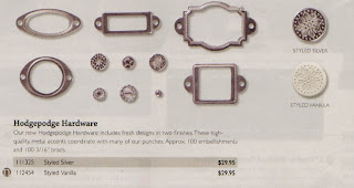
An example of some YUMMY hardware from Stampin' Up!
Don't Forget the Journaling
Journaling is one of the most important parts of a scrapbook. Journaling provides important details about the events or people in your photos. A title is one way to tie the theme of the photos together. When writing about your photos, follow the theme that you chose when you were selecting embellishments.
Add a quote, song lyrics, or the title of the occasion to reflect your page's theme. Add it directly on the page with your rubber stamps or stamp/print your title on coordinating card stock, trim out and attach. Journaling can be handwritten (my preference) or done by using your computer to type it out, just print on acid free paper or card stock.
After giving your page a title, include some information about the people in the photos or details of the events. At the minimum, try to include the name of the person in the photo and the date the photo was taken. Sometimes I limit the date to a month but include the true date on the back of my layout. Once I have several pages for an album that are chronological I don't want them all to include the year....might be a bit redundant.
Arrange the Layout Again and Make it Stick
Before you permanently tape everything down, experiment with the layout. Rearrange the photos and embellishments on the page until you find the best look. I have found myself taking a whole new direction and the end result was a much better page!
Once you are happy with your layout, secure your items to the page. There are several types of adhesives available to scrapbookers including glue, tape, spray adhesive and photo corners. Try using a few different items to see which you like best. Glue sticks work well for die-cuts and other embellishments, securing them firmly to the page. I like my good ole double stick tape!
Put Them Away
I have a little easel on a shelf in my studio and I like to display my pages on it. So when I finish a new layout, I rotate my "new favorite" to the easel. But aside from an easel or a frame, I recommend you keep your finished pages in page protectors ready for an album, or go ahead and put them in an album. Don't stack them on top of each other...additionally you should never store your albums flat, they should be kept upright vertically to prevent bulky embellishments from damaging adjacent pages.
Personally, I like a top loading post bound album. They are easy to rearrange if you need to by just pulling the pages from the protectors and moving them. Since I don't scrap chronologically I have several albums going at the same time. But I wouldn't have it any other way. It allows me to scrap what I'm inspired by at the moment, and since my free time is limited, this is what works best for me!


u.jpg)
u_closeup.jpg)
